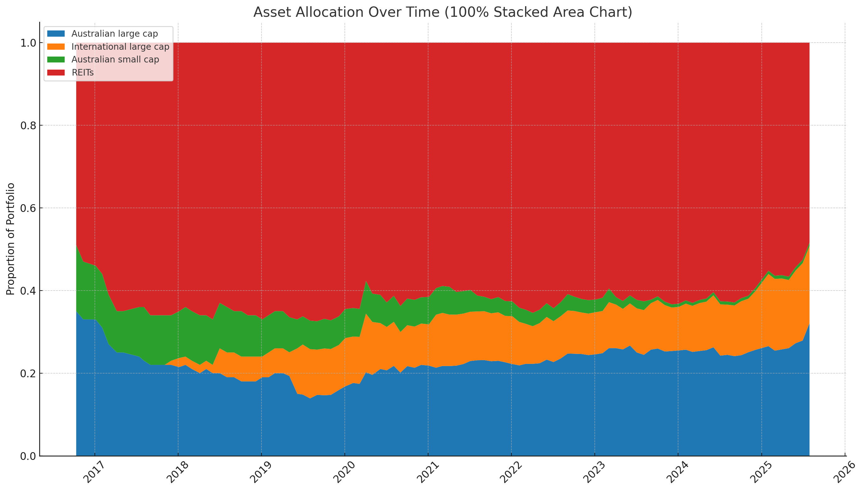
I’d love the Diversity section to display a 100% stacked chart of my asset allocations over time, similar to the attached image. The data is all there, and I currently extract it and then use Excel/AI to create it, but it’d be great to be able to create it natively within Sharesight.